Business Dashboard
PRODUCT COMPARISON DASHBOARD
1. PROJECT OVERVIEW
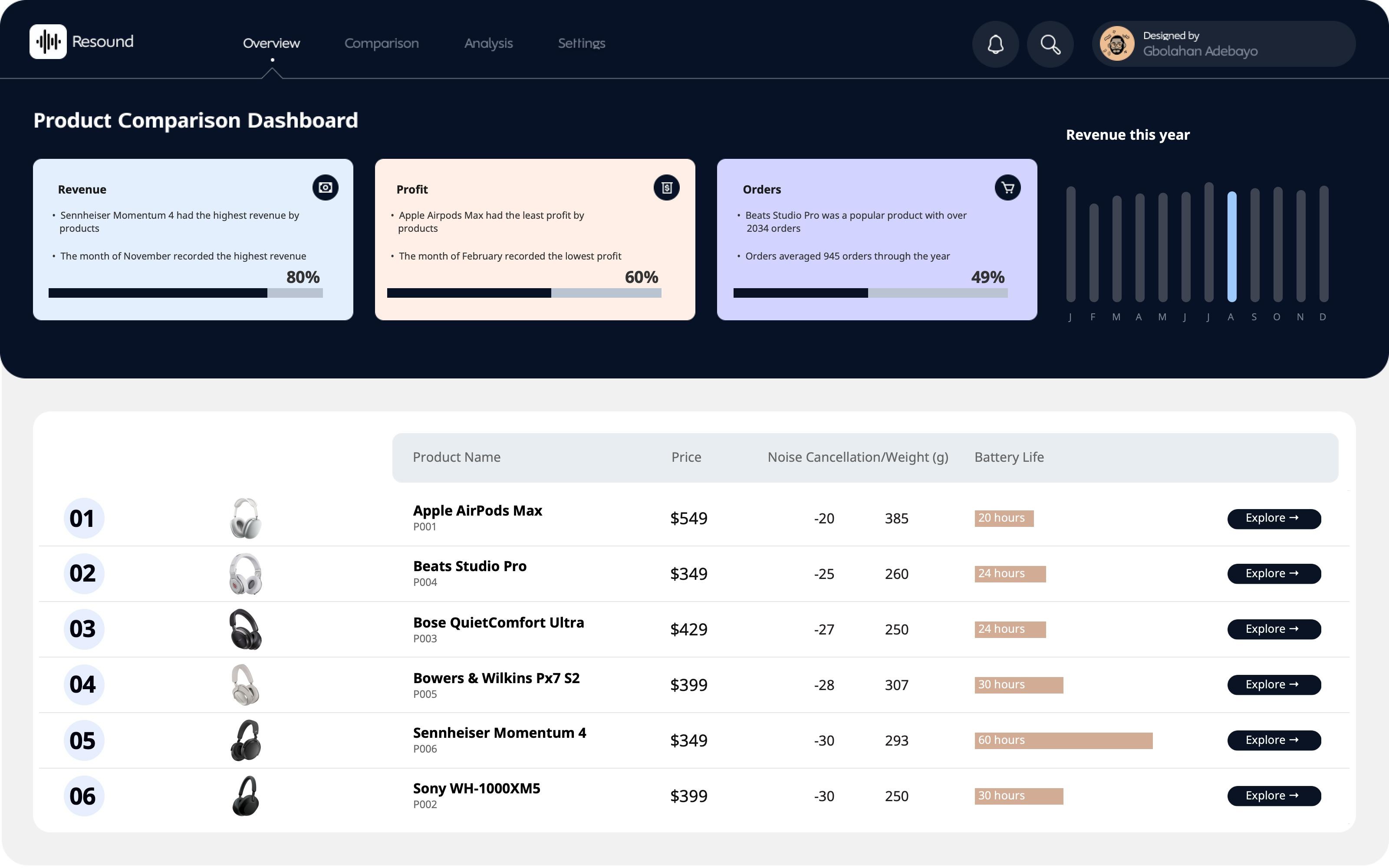
The Product Comparison Dashboard delivers comprehensive performance analytics across six premium headphone products, enabling sales and product teams to understand revenue drivers, profitability patterns, and customer behavior. Designed for retail managers and e-commerce analysts, this dual-view dashboard answers critical business questions: Which products generate the most revenue and profit? How do products compare in order volume and customer distribution? What are the geographic sales patterns and transaction trends? By consolidating product performance metrics, monthly trends, and transaction-level data into one interactive interface, the dashboard eliminates the need to compile multiple reports or query databases for competitive product insights.
2. DATA & REQUIREMENTS
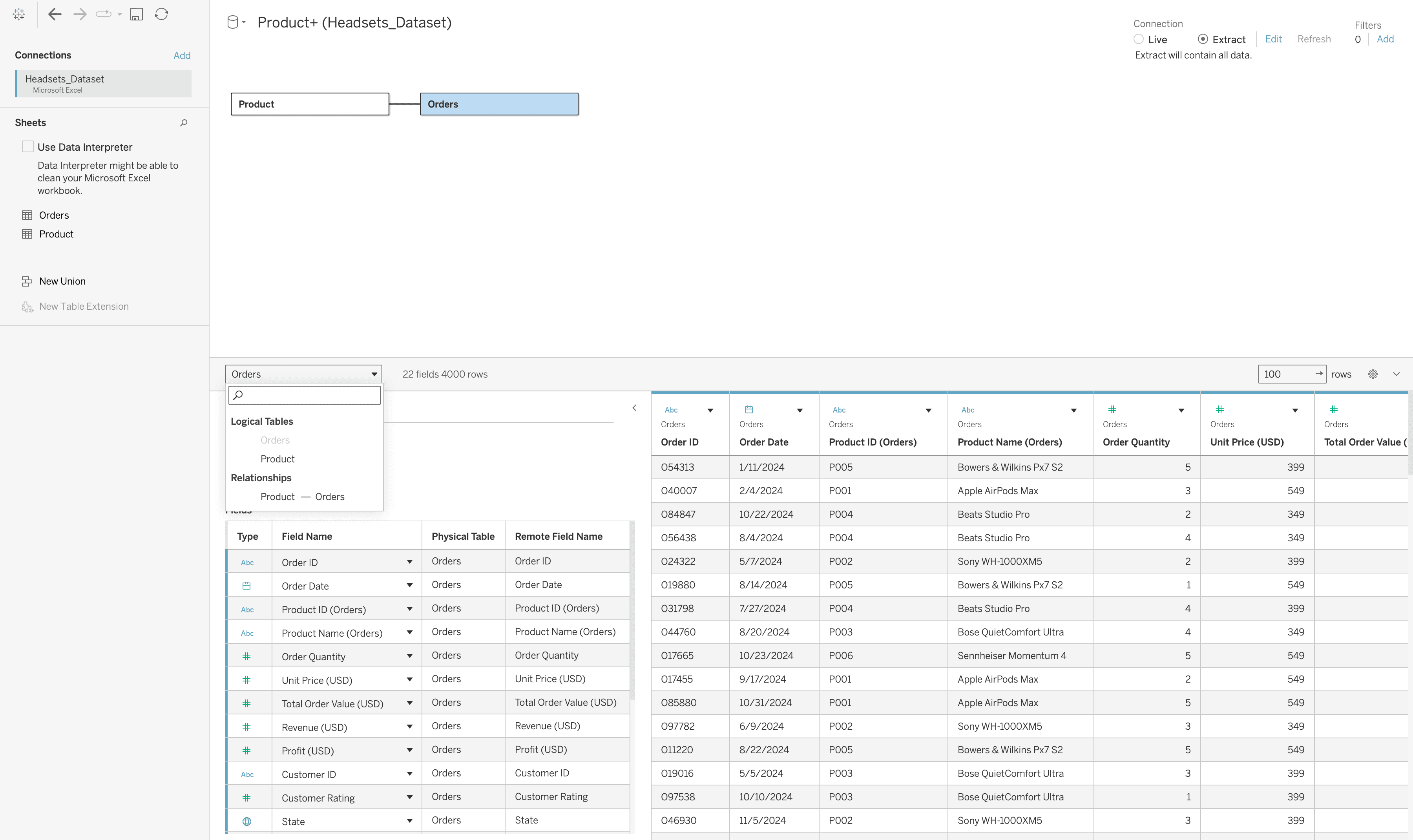
The system tracks complete product performance data across six headphone models: Apple AirPods Max, Beats Studio Pro, Bose QuietComfort Ultra, Bowers & Wilkins Px7 S2, Sennheiser Momentum 4, and Sony WH-1000XM5. Each product record includes pricing, technical specifications (noise cancellation rating, weight, battery life), monthly sales metrics (profit, revenue, orders, buyers), return status counts, geographic distribution across US states, and individual transaction details with order IDs, dates, quantities, and profitability. The primary requirement was building a comparative analytics tool where teams could evaluate product performance side by side, track monthly KPI trends, identify top-performing products by different metrics, and drill down into transaction-level details without manual data aggregation.
3. INTERACTIVE FEATURES
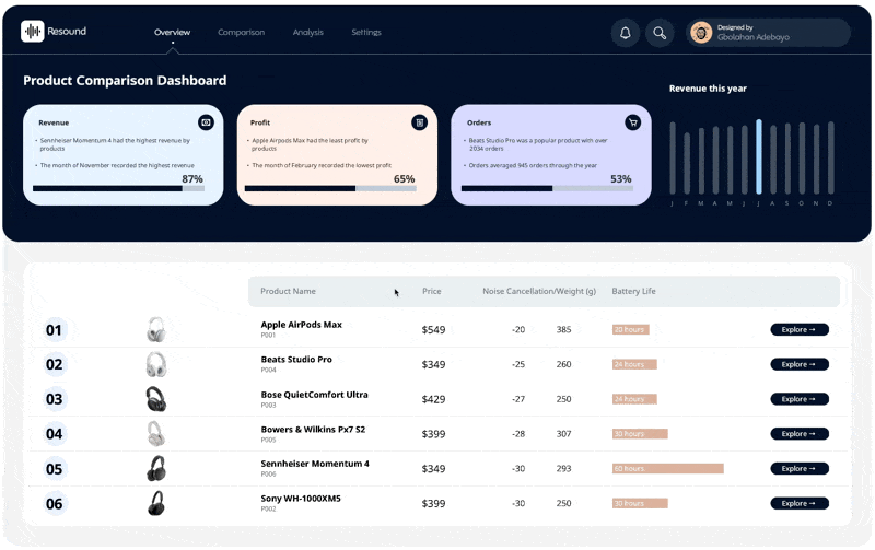
The dashboard operates in two modes accessible through the main navigation. The Overview page displays three insight cards highlighting revenue leaders (Sennheiser Momentum 4 at 87%), profit performers (Apple AirPods Max at 65%), and order volume champions (Beats Studio Pro with 2034 orders). A comprehensive product table lists all six items with key specs and "Explore" buttons for detailed analysis. The yearly revenue trend chart shows monthly patterns across all products. Clicking any "Explore" button opens the detailed Product View with four key metric cards (Profit, Revenue, Orders, Buyers) showing current values, comparisons to benchmarks, and 12-month sparkline trends. Users can switch between months using letter buttons (J, F, M, A, etc.) to see how metrics evolve. The view includes profit performance bars comparing all products, return status breakdowns showing order counts by product, state-level geographic maps with alternative bar chart views, top transaction tables with downloadable data, and customer distribution histograms showing order value patterns. A comparison dropdown allows users to benchmark any product against competitors in real time.
4. TECHNICAL EXECUTION & OUTCOME
Built in Tableau Desktop with custom navigation using parameter actions and button controls, the dashboard leverages calculated fields for percentage-to-target metrics, month-over-month comparisons, and profitability rankings. Geographic visualization employs filled US state maps with dynamic coloring based on sales concentration. The technical design uses coordinated dashboard actions, ensuring all visualizations update simultaneously when users switch products or time periods. Clean UI design with distinct color-coded cards (blue for revenue, beige for profit, purple for orders) provides instant visual differentiation between metrics. The result is a self-service product analytics platform that enables sales teams to identify which products drive revenue versus profit, product managers to understand geographic performance disparities, and operations teams to track return patterns and transaction volumes. This comprehensive view eliminates hours of manual SQL queries and Excel pivoting, transforming product data from scattered reports into a unified strategic resource for inventory planning, pricing decisions, and marketing campaign targeting.
More Projects


Business Dashboard
PRODUCT COMPARISON DASHBOARD
1. PROJECT OVERVIEW
The Product Comparison Dashboard delivers comprehensive performance analytics across six premium headphone products, enabling sales and product teams to understand revenue drivers, profitability patterns, and customer behavior. Designed for retail managers and e-commerce analysts, this dual-view dashboard answers critical business questions: Which products generate the most revenue and profit? How do products compare in order volume and customer distribution? What are the geographic sales patterns and transaction trends? By consolidating product performance metrics, monthly trends, and transaction-level data into one interactive interface, the dashboard eliminates the need to compile multiple reports or query databases for competitive product insights.
2. DATA & REQUIREMENTS
The system tracks complete product performance data across six headphone models: Apple AirPods Max, Beats Studio Pro, Bose QuietComfort Ultra, Bowers & Wilkins Px7 S2, Sennheiser Momentum 4, and Sony WH-1000XM5. Each product record includes pricing, technical specifications (noise cancellation rating, weight, battery life), monthly sales metrics (profit, revenue, orders, buyers), return status counts, geographic distribution across US states, and individual transaction details with order IDs, dates, quantities, and profitability. The primary requirement was building a comparative analytics tool where teams could evaluate product performance side by side, track monthly KPI trends, identify top-performing products by different metrics, and drill down into transaction-level details without manual data aggregation.
3. INTERACTIVE FEATURES
The dashboard operates in two modes accessible through the main navigation. The Overview page displays three insight cards highlighting revenue leaders (Sennheiser Momentum 4 at 87%), profit performers (Apple AirPods Max at 65%), and order volume champions (Beats Studio Pro with 2034 orders). A comprehensive product table lists all six items with key specs and "Explore" buttons for detailed analysis. The yearly revenue trend chart shows monthly patterns across all products. Clicking any "Explore" button opens the detailed Product View with four key metric cards (Profit, Revenue, Orders, Buyers) showing current values, comparisons to benchmarks, and 12-month sparkline trends. Users can switch between months using letter buttons (J, F, M, A, etc.) to see how metrics evolve. The view includes profit performance bars comparing all products, return status breakdowns showing order counts by product, state-level geographic maps with alternative bar chart views, top transaction tables with downloadable data, and customer distribution histograms showing order value patterns. A comparison dropdown allows users to benchmark any product against competitors in real time.
4. TECHNICAL EXECUTION & OUTCOME
Built in Tableau Desktop with custom navigation using parameter actions and button controls, the dashboard leverages calculated fields for percentage-to-target metrics, month-over-month comparisons, and profitability rankings. Geographic visualization employs filled US state maps with dynamic coloring based on sales concentration. The technical design uses coordinated dashboard actions, ensuring all visualizations update simultaneously when users switch products or time periods. Clean UI design with distinct color-coded cards (blue for revenue, beige for profit, purple for orders) provides instant visual differentiation between metrics. The result is a self-service product analytics platform that enables sales teams to identify which products drive revenue versus profit, product managers to understand geographic performance disparities, and operations teams to track return patterns and transaction volumes. This comprehensive view eliminates hours of manual SQL queries and Excel pivoting, transforming product data from scattered reports into a unified strategic resource for inventory planning, pricing decisions, and marketing campaign targeting.
More Projects
Business Dashboard
PRODUCT COMPARISON DASHBOARD
1. PROJECT OVERVIEW
The Product Comparison Dashboard delivers comprehensive performance analytics across six premium headphone products, enabling sales and product teams to understand revenue drivers, profitability patterns, and customer behavior. Designed for retail managers and e-commerce analysts, this dual-view dashboard answers critical business questions: Which products generate the most revenue and profit? How do products compare in order volume and customer distribution? What are the geographic sales patterns and transaction trends? By consolidating product performance metrics, monthly trends, and transaction-level data into one interactive interface, the dashboard eliminates the need to compile multiple reports or query databases for competitive product insights.
2. DATA & REQUIREMENTS
The system tracks complete product performance data across six headphone models: Apple AirPods Max, Beats Studio Pro, Bose QuietComfort Ultra, Bowers & Wilkins Px7 S2, Sennheiser Momentum 4, and Sony WH-1000XM5. Each product record includes pricing, technical specifications (noise cancellation rating, weight, battery life), monthly sales metrics (profit, revenue, orders, buyers), return status counts, geographic distribution across US states, and individual transaction details with order IDs, dates, quantities, and profitability. The primary requirement was building a comparative analytics tool where teams could evaluate product performance side by side, track monthly KPI trends, identify top-performing products by different metrics, and drill down into transaction-level details without manual data aggregation.
3. INTERACTIVE FEATURES
The dashboard operates in two modes accessible through the main navigation. The Overview page displays three insight cards highlighting revenue leaders (Sennheiser Momentum 4 at 87%), profit performers (Apple AirPods Max at 65%), and order volume champions (Beats Studio Pro with 2034 orders). A comprehensive product table lists all six items with key specs and "Explore" buttons for detailed analysis. The yearly revenue trend chart shows monthly patterns across all products. Clicking any "Explore" button opens the detailed Product View with four key metric cards (Profit, Revenue, Orders, Buyers) showing current values, comparisons to benchmarks, and 12-month sparkline trends. Users can switch between months using letter buttons (J, F, M, A, etc.) to see how metrics evolve. The view includes profit performance bars comparing all products, return status breakdowns showing order counts by product, state-level geographic maps with alternative bar chart views, top transaction tables with downloadable data, and customer distribution histograms showing order value patterns. A comparison dropdown allows users to benchmark any product against competitors in real time.
4. TECHNICAL EXECUTION & OUTCOME
Built in Tableau Desktop with custom navigation using parameter actions and button controls, the dashboard leverages calculated fields for percentage-to-target metrics, month-over-month comparisons, and profitability rankings. Geographic visualization employs filled US state maps with dynamic coloring based on sales concentration. The technical design uses coordinated dashboard actions, ensuring all visualizations update simultaneously when users switch products or time periods. Clean UI design with distinct color-coded cards (blue for revenue, beige for profit, purple for orders) provides instant visual differentiation between metrics. The result is a self-service product analytics platform that enables sales teams to identify which products drive revenue versus profit, product managers to understand geographic performance disparities, and operations teams to track return patterns and transaction volumes. This comprehensive view eliminates hours of manual SQL queries and Excel pivoting, transforming product data from scattered reports into a unified strategic resource for inventory planning, pricing decisions, and marketing campaign targeting.