Creative Visualization
PRESS FREEDOM INDEX
1. PROJECT OVERVIEW
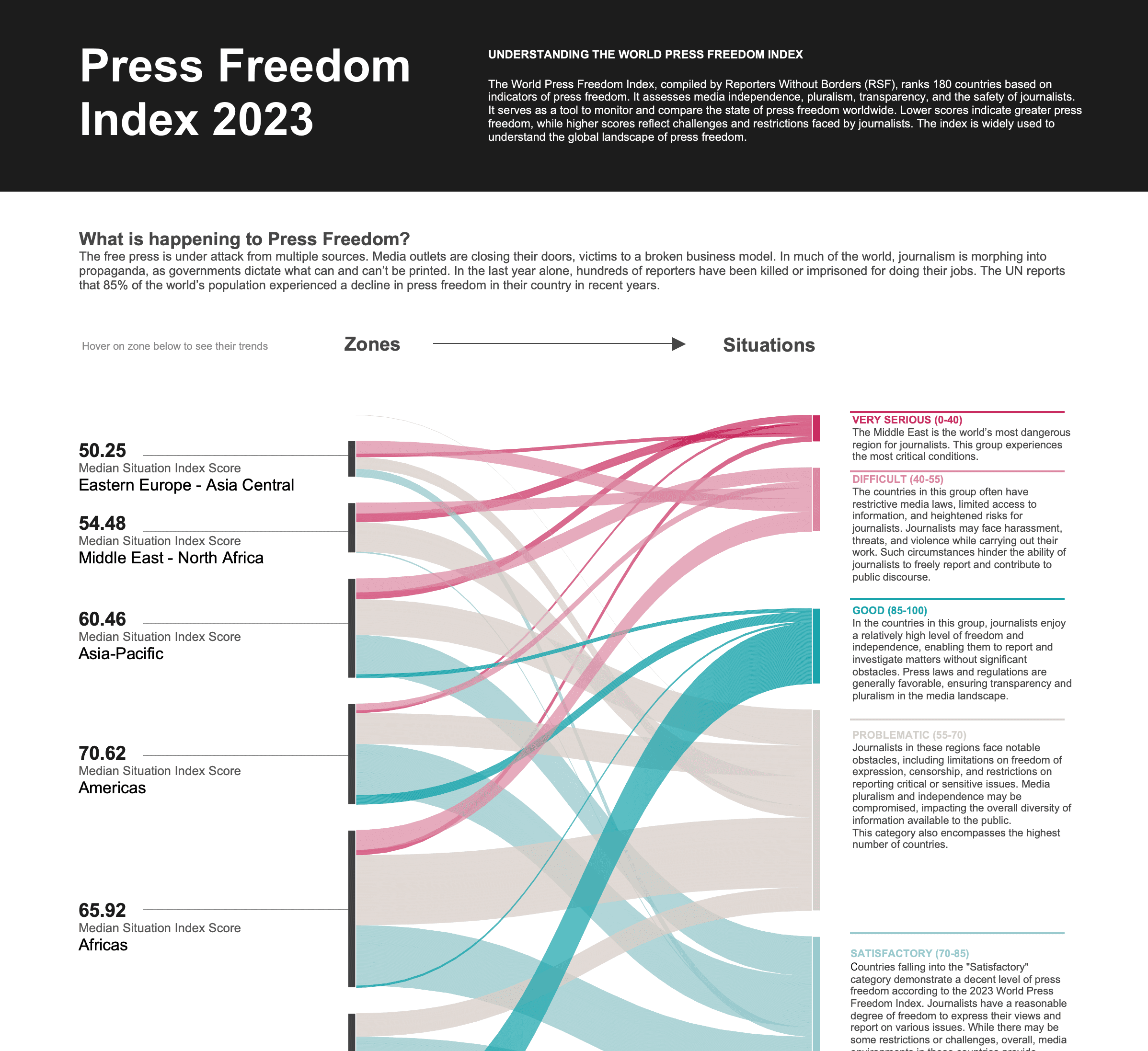
The Press Freedom Index 2023 visualization transforms data from Reporters Without Borders into an interactive narrative exploring press freedom across 180 countries worldwide. Designed for journalists, human rights advocates, policymakers, and the general public, this data story answers critical questions: How does press freedom vary across global regions? Which countries face the most severe threats to journalism? What patterns emerge when comparing zones and situation categories? By translating complex index scores into flowing visual forms, the visualization makes global press freedom trends accessible to audiences who might find traditional statistical reports overwhelming or difficult to interpret.
2. DATA & REQUIREMENTS
The visualization analyzes comprehensive press freedom data spanning 180 countries organized into six geographic zones: European Union & Balkans, Americas, Africa, Asia-Pacific, Middle East & North Africa, and Eastern Europe & Asia Central. Each country receives a situation classification across five categories: Very Serious (0 to 40), Difficult (40 to 55), Problematic (55 to 70), Satisfactory (70 to 85), and Good (85 to 100). The dataset includes median situation index scores for each zone and country-level classifications used by Reporters Without Borders to assess media independence, pluralism, transparency, and journalist safety. The primary requirement was creating an engaging visual story that highlights the alarming statistic that 85% of the world's population experienced press freedom while making individual country situations explorable through intuitive visual patterns.
3. INTERACTIVE FEATURES
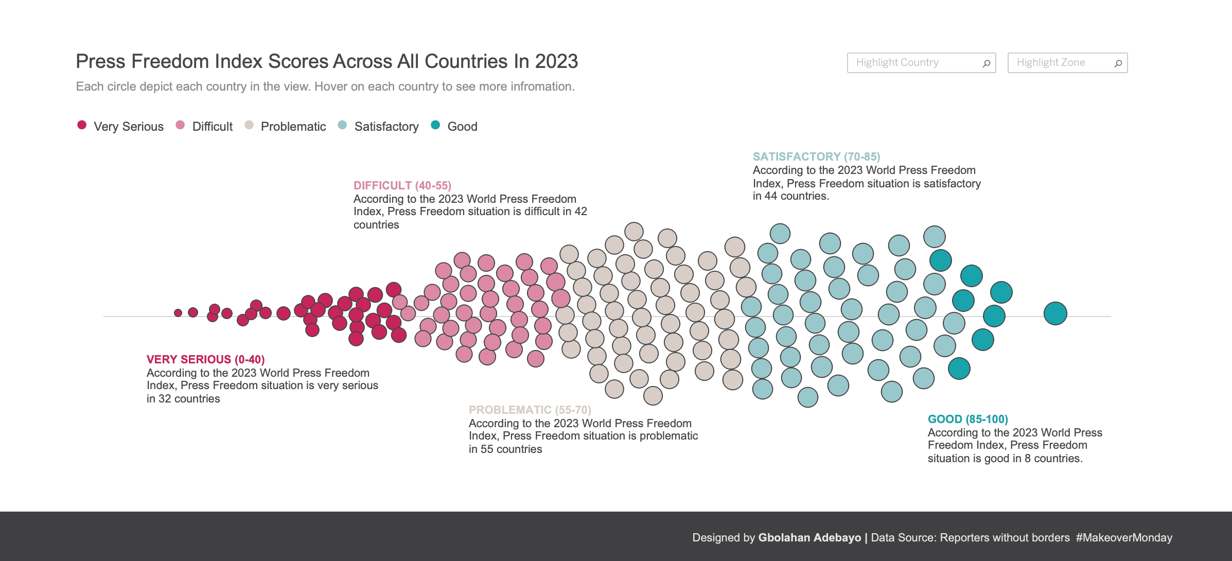
The visualization employs a Sankey diagram as the centerpiece, showing how geographic zones flow into situation categories through proportionally sized streams. Users can hover over any zone on the left to see its median score and regional classification. The flow ribbons use strategic color coding: pink/red tones for concerning situations (Very Serious, Difficult, Problematic), beige for middle-ground categories, and teal/blue for positive situations (Good, Satisfactory). This creates instant visual recognition of which regions contribute most to press freedom challenges. The right side displays detailed descriptions for each situation category, explaining what conditions journalists face. Below the Sankey diagram, a beeswarm chart displays all 180 countries as individual circles, arranged organically to show the concentration and distribution across the five situation categories. Each circle represents one country, color-coded by classification, clustering naturally around category boundaries to reveal the density of countries in each press freedom tier. This arrangement makes the scale of press freedom challenges immediately visible while avoiding overlapping dots. Annotations highlight key statistics: 6 countries in Very Serious, 42 in Difficult, 55 in Problematic, 44 in Satisfactory, and 6 in Good categories.
4. TECHNICAL EXECUTION & OUTCOME
Developed in Tableau Desktop using ChatGPT-generated survey data, the dashboard leverages parameter actions for question navigation, dashboard actions for cross-filtering, and calculated fields to drive dynamic demographic aggregations. The technical architecture ensures all visualizations update simultaneously when users interact with any element, maintaining data consistency across views. The result: stakeholders can now explore 100+ survey responses and uncover demographic insights in under 3 clicks, eliminating hours of manual pivot table analysis. This self-service capability empowers marketing teams to validate assumptions, identify target segments, and make data-driven campaign decisions independently—transforming survey data from a static report into an ongoing strategic asset.
More Projects

Creative Visualization
PRESS FREEDOM INDEX
1. PROJECT OVERVIEW
The Press Freedom Index 2023 visualization transforms data from Reporters Without Borders into an interactive narrative exploring press freedom across 180 countries worldwide. Designed for journalists, human rights advocates, policymakers, and the general public, this data story answers critical questions: How does press freedom vary across global regions? Which countries face the most severe threats to journalism? What patterns emerge when comparing zones and situation categories? By translating complex index scores into flowing visual forms, the visualization makes global press freedom trends accessible to audiences who might find traditional statistical reports overwhelming or difficult to interpret.
2. DATA & REQUIREMENTS
The visualization analyzes comprehensive press freedom data spanning 180 countries organized into six geographic zones: European Union & Balkans, Americas, Africa, Asia-Pacific, Middle East & North Africa, and Eastern Europe & Asia Central. Each country receives a situation classification across five categories: Very Serious (0 to 40), Difficult (40 to 55), Problematic (55 to 70), Satisfactory (70 to 85), and Good (85 to 100). The dataset includes median situation index scores for each zone and country-level classifications used by Reporters Without Borders to assess media independence, pluralism, transparency, and journalist safety. The primary requirement was creating an engaging visual story that highlights the alarming statistic that 85% of the world's population experienced press freedom while making individual country situations explorable through intuitive visual patterns.
3. INTERACTIVE FEATURES
The visualization employs a Sankey diagram as the centerpiece, showing how geographic zones flow into situation categories through proportionally sized streams. Users can hover over any zone on the left to see its median score and regional classification. The flow ribbons use strategic color coding: pink/red tones for concerning situations (Very Serious, Difficult, Problematic), beige for middle-ground categories, and teal/blue for positive situations (Good, Satisfactory). This creates instant visual recognition of which regions contribute most to press freedom challenges. The right side displays detailed descriptions for each situation category, explaining what conditions journalists face. Below the Sankey diagram, a beeswarm chart displays all 180 countries as individual circles, arranged organically to show the concentration and distribution across the five situation categories. Each circle represents one country, color-coded by classification, clustering naturally around category boundaries to reveal the density of countries in each press freedom tier. This arrangement makes the scale of press freedom challenges immediately visible while avoiding overlapping dots. Annotations highlight key statistics: 6 countries in Very Serious, 42 in Difficult, 55 in Problematic, 44 in Satisfactory, and 6 in Good categories.
4. TECHNICAL EXECUTION & OUTCOME
Developed in Tableau Desktop using ChatGPT-generated survey data, the dashboard leverages parameter actions for question navigation, dashboard actions for cross-filtering, and calculated fields to drive dynamic demographic aggregations. The technical architecture ensures all visualizations update simultaneously when users interact with any element, maintaining data consistency across views. The result: stakeholders can now explore 100+ survey responses and uncover demographic insights in under 3 clicks, eliminating hours of manual pivot table analysis. This self-service capability empowers marketing teams to validate assumptions, identify target segments, and make data-driven campaign decisions independently—transforming survey data from a static report into an ongoing strategic asset.
More Projects
Creative Visualization
PRESS FREEDOM INDEX
1. PROJECT OVERVIEW
The Press Freedom Index 2023 visualization transforms data from Reporters Without Borders into an interactive narrative exploring press freedom across 180 countries worldwide. Designed for journalists, human rights advocates, policymakers, and the general public, this data story answers critical questions: How does press freedom vary across global regions? Which countries face the most severe threats to journalism? What patterns emerge when comparing zones and situation categories? By translating complex index scores into flowing visual forms, the visualization makes global press freedom trends accessible to audiences who might find traditional statistical reports overwhelming or difficult to interpret.
2. DATA & REQUIREMENTS
The visualization analyzes comprehensive press freedom data spanning 180 countries organized into six geographic zones: European Union & Balkans, Americas, Africa, Asia-Pacific, Middle East & North Africa, and Eastern Europe & Asia Central. Each country receives a situation classification across five categories: Very Serious (0 to 40), Difficult (40 to 55), Problematic (55 to 70), Satisfactory (70 to 85), and Good (85 to 100). The dataset includes median situation index scores for each zone and country-level classifications used by Reporters Without Borders to assess media independence, pluralism, transparency, and journalist safety. The primary requirement was creating an engaging visual story that highlights the alarming statistic that 85% of the world's population experienced press freedom while making individual country situations explorable through intuitive visual patterns.
3. INTERACTIVE FEATURES
The visualization employs a Sankey diagram as the centerpiece, showing how geographic zones flow into situation categories through proportionally sized streams. Users can hover over any zone on the left to see its median score and regional classification. The flow ribbons use strategic color coding: pink/red tones for concerning situations (Very Serious, Difficult, Problematic), beige for middle-ground categories, and teal/blue for positive situations (Good, Satisfactory). This creates instant visual recognition of which regions contribute most to press freedom challenges. The right side displays detailed descriptions for each situation category, explaining what conditions journalists face. Below the Sankey diagram, a beeswarm chart displays all 180 countries as individual circles, arranged organically to show the concentration and distribution across the five situation categories. Each circle represents one country, color-coded by classification, clustering naturally around category boundaries to reveal the density of countries in each press freedom tier. This arrangement makes the scale of press freedom challenges immediately visible while avoiding overlapping dots. Annotations highlight key statistics: 6 countries in Very Serious, 42 in Difficult, 55 in Problematic, 44 in Satisfactory, and 6 in Good categories.
4. TECHNICAL EXECUTION & OUTCOME
Developed in Tableau Desktop using ChatGPT-generated survey data, the dashboard leverages parameter actions for question navigation, dashboard actions for cross-filtering, and calculated fields to drive dynamic demographic aggregations. The technical architecture ensures all visualizations update simultaneously when users interact with any element, maintaining data consistency across views. The result: stakeholders can now explore 100+ survey responses and uncover demographic insights in under 3 clicks, eliminating hours of manual pivot table analysis. This self-service capability empowers marketing teams to validate assumptions, identify target segments, and make data-driven campaign decisions independently—transforming survey data from a static report into an ongoing strategic asset.