DATA VISUALIZATION: HOW TO APPROACH YOUR DATA
Insights
Dec 23, 2022

As a data analyst looking to build a portfolio, you will probably spend some time looking for that perfect dataset that you would like to visualize insights from to build your portfolio. A common scenario we all face after finally having the dataset is how we visualize the insights gotten from the data.
In this article, I will be discussing with Mr. Idris Akilapa to understand the creative process behind his visualizations and the creative process he puts into his work. Mr. Idris Akilapa is a freelance data analyst, a Tableau Public Featured Author, and has had his visualizations win the Tableau VOTD (Viz Of The Day) three times.
Hello Mr. Idris Akilapa, Can you please introduce yourself?
Hello, Thank you for the invitation. I am grateful for the opportunity to discuss Data analytics and its visualization process. My name is Idris Akilapa, a Tableau developer and data analyst.
So firstly, what is your definition of Data Analysis?
There are several meanings and definitions attached to data analysis, but from my perspective, I’ll say that Data analysis is the process of identifying a problem, collecting necessary data, transforming the data, modeling the raw data, and extracting actionable and relevant information that helps solve problems while making informed decisions.
Thank you. What would you say is your favorite stage in the data analysis process?
Data analysis has several stages you have to go through before you can share insights to stakeholders, and these steps depend on the type of problem that you are trying to solve. Some of these stages are data collection, data cleaning, data transformation, data visualization, and presentation of insights. Among all the steps, I’d say that data visualization is my favorite. This is because it is the stage that all the managers, CEOs, and business stakeholders always look forward to. They want to know how their problems can be solved.
Great visualization and storytelling with data are one of the major problem-solving stages. No one is going to understand numbers, patterns, or outliers by just looking at excel files but all these can be spotted at a glance with the help of good visualization and storytelling.
If the visualization and storytelling stage is your favorite stage of the data analysis, what would you then say is your definition of data visualization?
I would say Data visualization is the practice of translating information into a visual context with the use of graphics, such as charts, plots, infographics, and even animations. This visual display of information communicates complex data relationships and show data-driven insights in a way that is easy to understand. Data visualization is not just about creating and adding charts just to put them together. It’s an art, it’s having your data tell a story, it’s color selection, blending, and alignment.
When you get a dataset for the first time, what comes to your mind before you start the visualization process?
I think this is a very important question to consider in the visualization process. My creative process usually depends on the type of data that I am working on. If I’m working on a dataset that is related to a Tableau challenge like the #B2VB or #MondayOverMonday, I try to do a lot of data exploration.
However, irrespective of the type of dashboard that you are working on, the first thing that you should consider is the person who will be making use of your visualization. A lot of times, you won’t even be there to explain the dashboard firsthand to the user so you have to make sure that your dashboard is able to communicate your desired message to the user.
Another important step is making sure that you understand the story that you believe the data can tell. You have to understand the dataset, understand the type of dashboard that will be required to represent the insights in the dashboard, understand the type of questions you want the dashboard to answer, and determine the best chart(s) to explain/visualize the data you are working on.
Thank you so much for such a detailed explanation! One of the most common problems data analysts face is usually determining the best type of charts that will pass across information most effectively. How do you work around the process of choosing the right chart for the right data?
“The right chart for the right data” question is one of the most difficult questions to give a perfect answer to. One thing that I believe is having a clear picture of what you want to pass across to your audience helps you to filter through many charts and choose the best one for you at that point. As a data analyst, you don’t rush into the dashboard creation process. It is important that you find a way to design a prototype of what you will like to build. You can design your prototype on a piece of paper or using tools such as Figma, Canva, or even Microsoft Powerpoint.
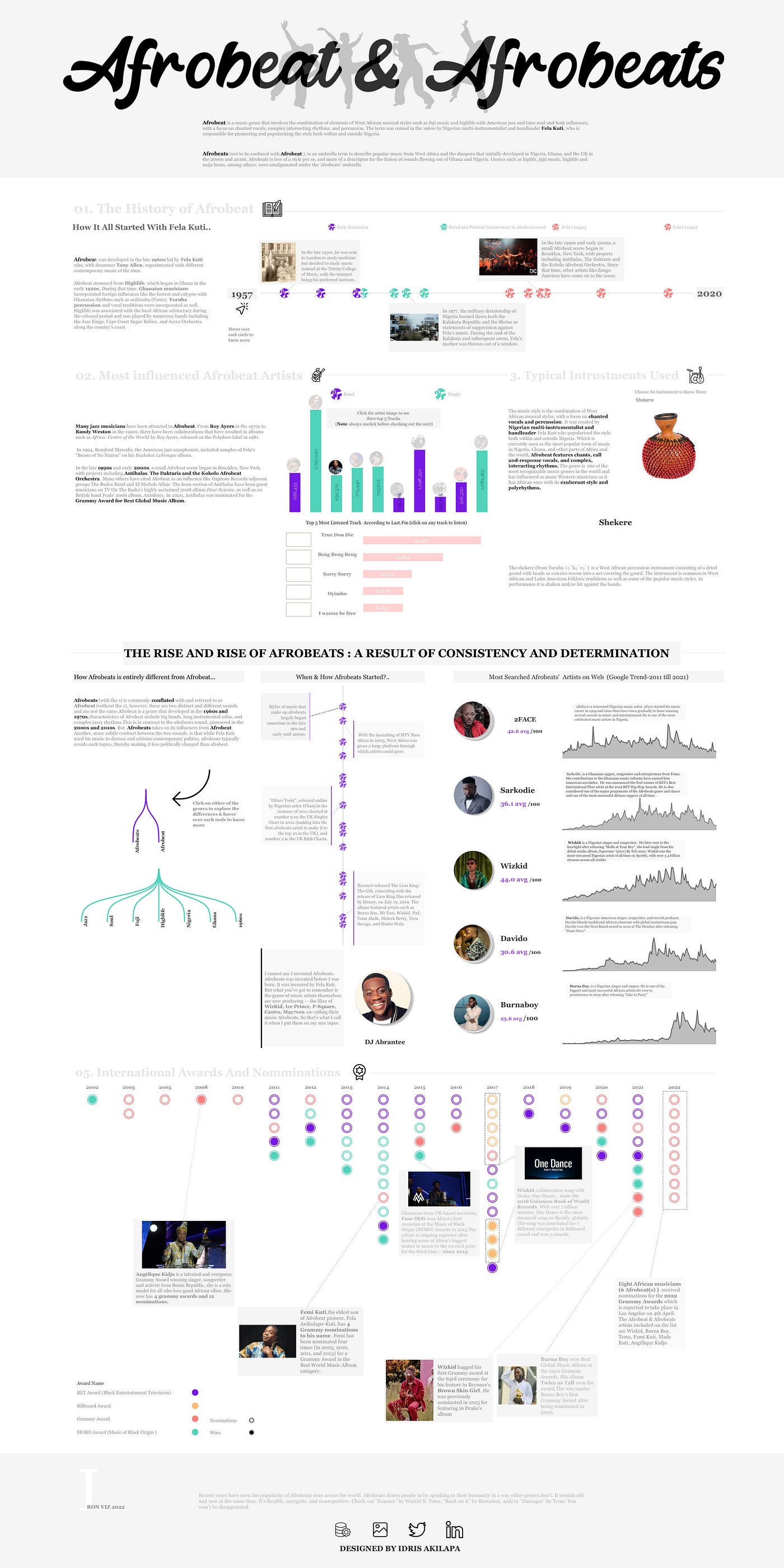
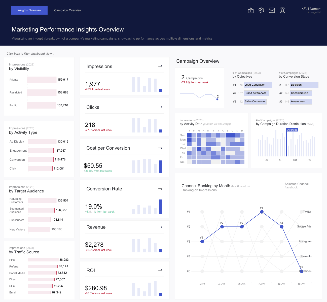
I’ll be sharing an example of a design prototype I once did on a piece of paper against the actual visualization result.
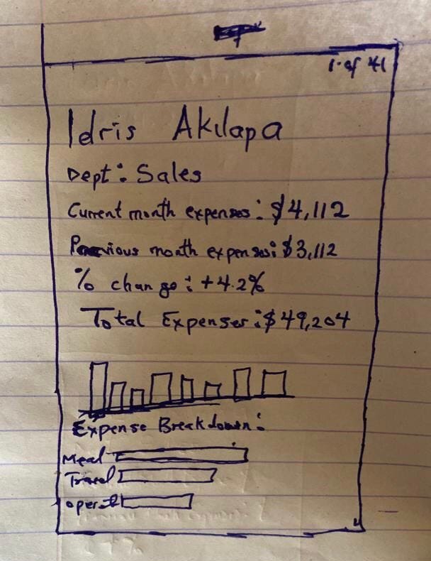
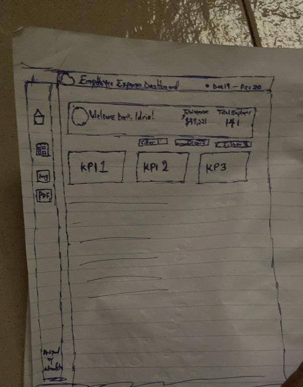
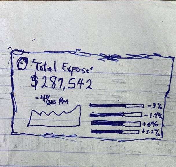
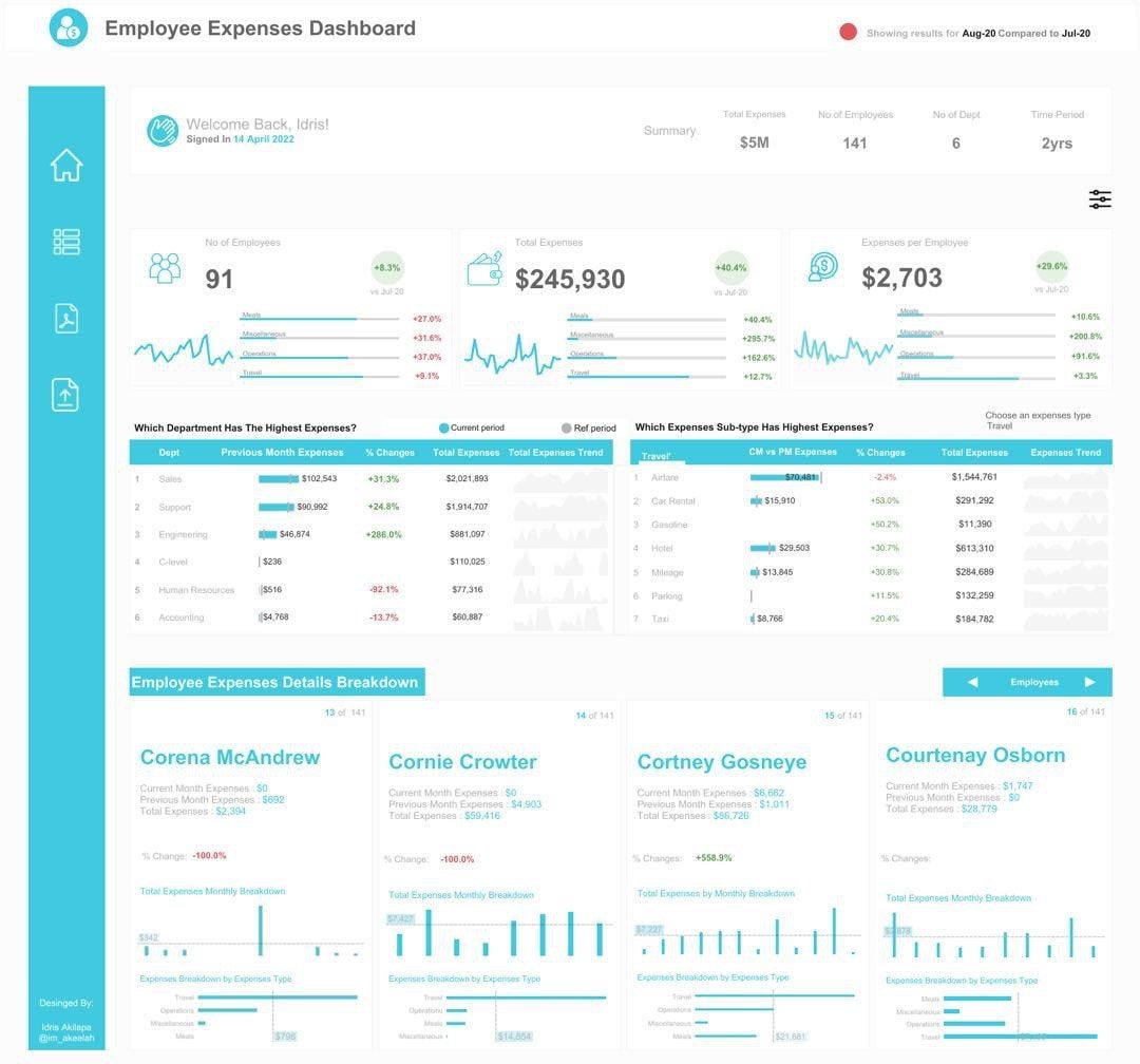
If you observe the images, you will notice some differences between the prototype and the actual dashboard but the overall theme remains the same. This shows that although you might have an idea of how you want your visualization to look, you should be open to the chance that you might have new ideas and choose to go with another chart at any point.
I also remind myself that in the world of visualization, there are very few things that are entirely new and haven’t been worked on before. If not exactly the same, then a very similar example will be available on the internet. If you are a Tableau user, make good use of the Tableau Public search bar to look for similar dashboards that relate to what you want to work on. Use keywords from your research topic to search for similar visualizations and take inspiration from them. Another tool I use to look for inspiration is Pinterest.
With consistent practice and experience, you will get to know the most suitable charts to represent diverse data insights. A tip for me is that while showing YoY(Year Over Year) increase or decrease in a business dashboard, I like to use BANs (Big A** Numbers) and while trying to tell a business story over a particular period of time, I lean more to using a line chart.
Personally as an analyst myself, sometimes I find it difficult to recognize the best chart to use. Your answer to the previous question has helped shed more light on how to improve oneself. Moving on to the next question: How do you work around adding elements of UI, design, and color to your dashboard/visualization?
Personally, I don’t see myself as someone who is naturally good at design or adept at using colors to beautify something. One thing that I do to help myself is to always check dashboard examples and keep myself updated on how people are able to design their dashboards and translate their creative ideas into visualizations.
As I have earlier said, with experience comes a lot of know-how. You are able to react to situations better and find quicker solutions to problems faced. As a data analyst, the design and color phase of the visualization process also comes with a lot of trial and error. Sometimes it just looks better in your head and not in your dashboard. Some tools I use to improve my visualization projects are flaticon.com for my Flaticons, icons8.com for my icons, Pinterest, Tableau Public, and Dribble for design inspirations. I also do some active learning by watching Youtube videos and that tends to be helpful too.
So tell me, what is your most challenging dashboard ever built? What will you also consider the best dashboard you have visualized?
Left to me, I’ll say that every viz I have worked on is tough because it is always a competition against yesterday’s version of myself. The toughest one which I must admit however is my first submission for the Ironviz competition.
For those unfamiliar with the competition, Iron Viz is the world’s largest data visualization competition and it is held annually at the Tableau Conference. Iron Viz is the ultimate battle of Tableau skills!
Three contestants are selected for the Grand Final of Iron Viz via a visualization contest (known as a “feeder” or “qualifier” competition) organized by Tableau Public. Each feeder is centered around a different topic. However, there is only one way to receive an invite to compete in the Iron Viz, and that is to win one of three top submission entries. During the contest, the three ‘Iron Vizzers’ compete live in front of several hundred conference attendees. Each contestant is given the same data set, and they have exactly 20 minutes to create the best data visualization they can before being judged by the audience.
Back to my Iron viz submission, being a first-timer was very challenging but as a curious data analyst, one needs to take that bold move because it is always worth it. You can see my Ironviz submission here.
As a good data analyst, it is imperative that you find your weaknesses and improve on them. How do you improve yourself?
I don’t have any particular pattern of learning Tableau but the greatest resource that helped me over the years is the Tableau community. The Tableau community has a lot of data gurus who create a lot of helpful content through their blogs, vlogs, tutorials, and webinars.
Here are my go-to guys whenever I want to learn something new;
The Flerlage twins: They both are Tableau visionaries and their website has a lot of Tableau and data visualization materials which could be very helpful.
Andy Kriebel: He is also a Tableau visionary. His Youtube channel is quite helpful to get enough information about Tableau resources. His tutorials also helped me hack how to use containers in building a Tableau dashboard.
SqlBelle: What I love the most about her Youtube Channel is the simplicity of her explanations. It is usually very beginner-friendly.
The main thing that I will always emphasize is that participating in Tableau community projects really helps to improve your visualization skills as an analyst. So far, it has helped me to learn, relearn and build an entire data visualization portfolio unconsciously.
My advice to whoever wants to take his/her data visualization skill to the next level is to join a visualization community and start participating in the various data community projects like #B2VB, #WOW (Work out Wednesday), #Ironviz, #DiversityIndata, #projecthealthviz, and #RFWD (Real world fake data).
Lastly, Mr. Akilapa. What is your preferred BI (Business Intelligence) tool and why?
I am a Tableau lover and my love for Tableau is what I will describe as “Love at first sight”. Everything on Tableau is neatly planned out and well structured. I also love the user interface. My major reason for picking Tableau though is the Tableau community. They are the best online data family and community ever.
That would be the end of the interview, Mr. Idris. Thank you so much for having the time to respond to questions and sharing your knowledge.
Thank you too. The pleasure is mine!
You can reach Mr. Idris Akilapa for freelancing gigs through his Twitter page, LinkedIn, or his Tableau Public profile.
Gbolahan is a passionate, creative, and goal-oriented analyst. He is a strong advocate of using data to help derive insights and make clients and companies make better data-driven decisions.
Connect with me on Medium
Get monthly inspiration, blog updates, and creative process notes — handcrafted for fellow creators.
More to Discover

DATA VISUALIZATION: HOW TO APPROACH YOUR DATA
Insights
Dec 23, 2022
As a data analyst looking to build a portfolio, you will probably spend some time looking for that perfect dataset that you would like to visualize insights from to build your portfolio. A common scenario we all face after finally having the dataset is how we visualize the insights gotten from the data.
In this article, I will be discussing with Mr. Idris Akilapa to understand the creative process behind his visualizations and the creative process he puts into his work. Mr. Idris Akilapa is a freelance data analyst, a Tableau Public Featured Author, and has had his visualizations win the Tableau VOTD (Viz Of The Day) three times.
Hello Mr. Idris Akilapa, Can you please introduce yourself?
Hello, Thank you for the invitation. I am grateful for the opportunity to discuss Data analytics and its visualization process. My name is Idris Akilapa, a Tableau developer and data analyst.
So firstly, what is your definition of Data Analysis?
There are several meanings and definitions attached to data analysis, but from my perspective, I’ll say that Data analysis is the process of identifying a problem, collecting necessary data, transforming the data, modeling the raw data, and extracting actionable and relevant information that helps solve problems while making informed decisions.
Thank you. What would you say is your favorite stage in the data analysis process?
Data analysis has several stages you have to go through before you can share insights to stakeholders, and these steps depend on the type of problem that you are trying to solve. Some of these stages are data collection, data cleaning, data transformation, data visualization, and presentation of insights. Among all the steps, I’d say that data visualization is my favorite. This is because it is the stage that all the managers, CEOs, and business stakeholders always look forward to. They want to know how their problems can be solved.
Great visualization and storytelling with data are one of the major problem-solving stages. No one is going to understand numbers, patterns, or outliers by just looking at excel files but all these can be spotted at a glance with the help of good visualization and storytelling.
If the visualization and storytelling stage is your favorite stage of the data analysis, what would you then say is your definition of data visualization?
I would say Data visualization is the practice of translating information into a visual context with the use of graphics, such as charts, plots, infographics, and even animations. This visual display of information communicates complex data relationships and show data-driven insights in a way that is easy to understand. Data visualization is not just about creating and adding charts just to put them together. It’s an art, it’s having your data tell a story, it’s color selection, blending, and alignment.
When you get a dataset for the first time, what comes to your mind before you start the visualization process?
I think this is a very important question to consider in the visualization process. My creative process usually depends on the type of data that I am working on. If I’m working on a dataset that is related to a Tableau challenge like the #B2VB or #MondayOverMonday, I try to do a lot of data exploration.
However, irrespective of the type of dashboard that you are working on, the first thing that you should consider is the person who will be making use of your visualization. A lot of times, you won’t even be there to explain the dashboard firsthand to the user so you have to make sure that your dashboard is able to communicate your desired message to the user.
Another important step is making sure that you understand the story that you believe the data can tell. You have to understand the dataset, understand the type of dashboard that will be required to represent the insights in the dashboard, understand the type of questions you want the dashboard to answer, and determine the best chart(s) to explain/visualize the data you are working on.
Thank you so much for such a detailed explanation! One of the most common problems data analysts face is usually determining the best type of charts that will pass across information most effectively. How do you work around the process of choosing the right chart for the right data?
“The right chart for the right data” question is one of the most difficult questions to give a perfect answer to. One thing that I believe is having a clear picture of what you want to pass across to your audience helps you to filter through many charts and choose the best one for you at that point. As a data analyst, you don’t rush into the dashboard creation process. It is important that you find a way to design a prototype of what you will like to build. You can design your prototype on a piece of paper or using tools such as Figma, Canva, or even Microsoft Powerpoint.
I’ll be sharing an example of a design prototype I once did on a piece of paper against the actual visualization result.
If you observe the images, you will notice some differences between the prototype and the actual dashboard but the overall theme remains the same. This shows that although you might have an idea of how you want your visualization to look, you should be open to the chance that you might have new ideas and choose to go with another chart at any point.
I also remind myself that in the world of visualization, there are very few things that are entirely new and haven’t been worked on before. If not exactly the same, then a very similar example will be available on the internet. If you are a Tableau user, make good use of the Tableau Public search bar to look for similar dashboards that relate to what you want to work on. Use keywords from your research topic to search for similar visualizations and take inspiration from them. Another tool I use to look for inspiration is Pinterest.
With consistent practice and experience, you will get to know the most suitable charts to represent diverse data insights. A tip for me is that while showing YoY(Year Over Year) increase or decrease in a business dashboard, I like to use BANs (Big A** Numbers) and while trying to tell a business story over a particular period of time, I lean more to using a line chart.
Personally as an analyst myself, sometimes I find it difficult to recognize the best chart to use. Your answer to the previous question has helped shed more light on how to improve oneself. Moving on to the next question: How do you work around adding elements of UI, design, and color to your dashboard/visualization?
Personally, I don’t see myself as someone who is naturally good at design or adept at using colors to beautify something. One thing that I do to help myself is to always check dashboard examples and keep myself updated on how people are able to design their dashboards and translate their creative ideas into visualizations.
As I have earlier said, with experience comes a lot of know-how. You are able to react to situations better and find quicker solutions to problems faced. As a data analyst, the design and color phase of the visualization process also comes with a lot of trial and error. Sometimes it just looks better in your head and not in your dashboard. Some tools I use to improve my visualization projects are flaticon.com for my Flaticons, icons8.com for my icons, Pinterest, Tableau Public, and Dribble for design inspirations. I also do some active learning by watching Youtube videos and that tends to be helpful too.
So tell me, what is your most challenging dashboard ever built? What will you also consider the best dashboard you have visualized?
Left to me, I’ll say that every viz I have worked on is tough because it is always a competition against yesterday’s version of myself. The toughest one which I must admit however is my first submission for the Ironviz competition.
For those unfamiliar with the competition, Iron Viz is the world’s largest data visualization competition and it is held annually at the Tableau Conference. Iron Viz is the ultimate battle of Tableau skills!
Three contestants are selected for the Grand Final of Iron Viz via a visualization contest (known as a “feeder” or “qualifier” competition) organized by Tableau Public. Each feeder is centered around a different topic. However, there is only one way to receive an invite to compete in the Iron Viz, and that is to win one of three top submission entries. During the contest, the three ‘Iron Vizzers’ compete live in front of several hundred conference attendees. Each contestant is given the same data set, and they have exactly 20 minutes to create the best data visualization they can before being judged by the audience.
Back to my Iron viz submission, being a first-timer was very challenging but as a curious data analyst, one needs to take that bold move because it is always worth it. You can see my Ironviz submission here.
As a good data analyst, it is imperative that you find your weaknesses and improve on them. How do you improve yourself?
I don’t have any particular pattern of learning Tableau but the greatest resource that helped me over the years is the Tableau community. The Tableau community has a lot of data gurus who create a lot of helpful content through their blogs, vlogs, tutorials, and webinars.
Here are my go-to guys whenever I want to learn something new;
The Flerlage twins: They both are Tableau visionaries and their website has a lot of Tableau and data visualization materials which could be very helpful.
Andy Kriebel: He is also a Tableau visionary. His Youtube channel is quite helpful to get enough information about Tableau resources. His tutorials also helped me hack how to use containers in building a Tableau dashboard.
SqlBelle: What I love the most about her Youtube Channel is the simplicity of her explanations. It is usually very beginner-friendly.
The main thing that I will always emphasize is that participating in Tableau community projects really helps to improve your visualization skills as an analyst. So far, it has helped me to learn, relearn and build an entire data visualization portfolio unconsciously.
My advice to whoever wants to take his/her data visualization skill to the next level is to join a visualization community and start participating in the various data community projects like #B2VB, #WOW (Work out Wednesday), #Ironviz, #DiversityIndata, #projecthealthviz, and #RFWD (Real world fake data).
Lastly, Mr. Akilapa. What is your preferred BI (Business Intelligence) tool and why?
I am a Tableau lover and my love for Tableau is what I will describe as “Love at first sight”. Everything on Tableau is neatly planned out and well structured. I also love the user interface. My major reason for picking Tableau though is the Tableau community. They are the best online data family and community ever.
That would be the end of the interview, Mr. Idris. Thank you so much for having the time to respond to questions and sharing your knowledge.
Thank you too. The pleasure is mine!
You can reach Mr. Idris Akilapa for freelancing gigs through his Twitter page, LinkedIn, or his Tableau Public profile.
Gbolahan is a passionate, creative, and goal-oriented analyst. He is a strong advocate of using data to help derive insights and make clients and companies make better data-driven decisions.
Connect with me on Medium
Get monthly inspiration, blog updates, and creative process notes — handcrafted for fellow creators.
More to Discover
DATA VISUALIZATION: HOW TO APPROACH YOUR DATA
Insights
Dec 23, 2022
As a data analyst looking to build a portfolio, you will probably spend some time looking for that perfect dataset that you would like to visualize insights from to build your portfolio. A common scenario we all face after finally having the dataset is how we visualize the insights gotten from the data.
In this article, I will be discussing with Mr. Idris Akilapa to understand the creative process behind his visualizations and the creative process he puts into his work. Mr. Idris Akilapa is a freelance data analyst, a Tableau Public Featured Author, and has had his visualizations win the Tableau VOTD (Viz Of The Day) three times.
Hello Mr. Idris Akilapa, Can you please introduce yourself?
Hello, Thank you for the invitation. I am grateful for the opportunity to discuss Data analytics and its visualization process. My name is Idris Akilapa, a Tableau developer and data analyst.
So firstly, what is your definition of Data Analysis?
There are several meanings and definitions attached to data analysis, but from my perspective, I’ll say that Data analysis is the process of identifying a problem, collecting necessary data, transforming the data, modeling the raw data, and extracting actionable and relevant information that helps solve problems while making informed decisions.
Thank you. What would you say is your favorite stage in the data analysis process?
Data analysis has several stages you have to go through before you can share insights to stakeholders, and these steps depend on the type of problem that you are trying to solve. Some of these stages are data collection, data cleaning, data transformation, data visualization, and presentation of insights. Among all the steps, I’d say that data visualization is my favorite. This is because it is the stage that all the managers, CEOs, and business stakeholders always look forward to. They want to know how their problems can be solved.
Great visualization and storytelling with data are one of the major problem-solving stages. No one is going to understand numbers, patterns, or outliers by just looking at excel files but all these can be spotted at a glance with the help of good visualization and storytelling.
If the visualization and storytelling stage is your favorite stage of the data analysis, what would you then say is your definition of data visualization?
I would say Data visualization is the practice of translating information into a visual context with the use of graphics, such as charts, plots, infographics, and even animations. This visual display of information communicates complex data relationships and show data-driven insights in a way that is easy to understand. Data visualization is not just about creating and adding charts just to put them together. It’s an art, it’s having your data tell a story, it’s color selection, blending, and alignment.
When you get a dataset for the first time, what comes to your mind before you start the visualization process?
I think this is a very important question to consider in the visualization process. My creative process usually depends on the type of data that I am working on. If I’m working on a dataset that is related to a Tableau challenge like the #B2VB or #MondayOverMonday, I try to do a lot of data exploration.
However, irrespective of the type of dashboard that you are working on, the first thing that you should consider is the person who will be making use of your visualization. A lot of times, you won’t even be there to explain the dashboard firsthand to the user so you have to make sure that your dashboard is able to communicate your desired message to the user.
Another important step is making sure that you understand the story that you believe the data can tell. You have to understand the dataset, understand the type of dashboard that will be required to represent the insights in the dashboard, understand the type of questions you want the dashboard to answer, and determine the best chart(s) to explain/visualize the data you are working on.
Thank you so much for such a detailed explanation! One of the most common problems data analysts face is usually determining the best type of charts that will pass across information most effectively. How do you work around the process of choosing the right chart for the right data?
“The right chart for the right data” question is one of the most difficult questions to give a perfect answer to. One thing that I believe is having a clear picture of what you want to pass across to your audience helps you to filter through many charts and choose the best one for you at that point. As a data analyst, you don’t rush into the dashboard creation process. It is important that you find a way to design a prototype of what you will like to build. You can design your prototype on a piece of paper or using tools such as Figma, Canva, or even Microsoft Powerpoint.
I’ll be sharing an example of a design prototype I once did on a piece of paper against the actual visualization result.
If you observe the images, you will notice some differences between the prototype and the actual dashboard but the overall theme remains the same. This shows that although you might have an idea of how you want your visualization to look, you should be open to the chance that you might have new ideas and choose to go with another chart at any point.
I also remind myself that in the world of visualization, there are very few things that are entirely new and haven’t been worked on before. If not exactly the same, then a very similar example will be available on the internet. If you are a Tableau user, make good use of the Tableau Public search bar to look for similar dashboards that relate to what you want to work on. Use keywords from your research topic to search for similar visualizations and take inspiration from them. Another tool I use to look for inspiration is Pinterest.
With consistent practice and experience, you will get to know the most suitable charts to represent diverse data insights. A tip for me is that while showing YoY(Year Over Year) increase or decrease in a business dashboard, I like to use BANs (Big A** Numbers) and while trying to tell a business story over a particular period of time, I lean more to using a line chart.
Personally as an analyst myself, sometimes I find it difficult to recognize the best chart to use. Your answer to the previous question has helped shed more light on how to improve oneself. Moving on to the next question: How do you work around adding elements of UI, design, and color to your dashboard/visualization?
Personally, I don’t see myself as someone who is naturally good at design or adept at using colors to beautify something. One thing that I do to help myself is to always check dashboard examples and keep myself updated on how people are able to design their dashboards and translate their creative ideas into visualizations.
As I have earlier said, with experience comes a lot of know-how. You are able to react to situations better and find quicker solutions to problems faced. As a data analyst, the design and color phase of the visualization process also comes with a lot of trial and error. Sometimes it just looks better in your head and not in your dashboard. Some tools I use to improve my visualization projects are flaticon.com for my Flaticons, icons8.com for my icons, Pinterest, Tableau Public, and Dribble for design inspirations. I also do some active learning by watching Youtube videos and that tends to be helpful too.
So tell me, what is your most challenging dashboard ever built? What will you also consider the best dashboard you have visualized?
Left to me, I’ll say that every viz I have worked on is tough because it is always a competition against yesterday’s version of myself. The toughest one which I must admit however is my first submission for the Ironviz competition.
For those unfamiliar with the competition, Iron Viz is the world’s largest data visualization competition and it is held annually at the Tableau Conference. Iron Viz is the ultimate battle of Tableau skills!
Three contestants are selected for the Grand Final of Iron Viz via a visualization contest (known as a “feeder” or “qualifier” competition) organized by Tableau Public. Each feeder is centered around a different topic. However, there is only one way to receive an invite to compete in the Iron Viz, and that is to win one of three top submission entries. During the contest, the three ‘Iron Vizzers’ compete live in front of several hundred conference attendees. Each contestant is given the same data set, and they have exactly 20 minutes to create the best data visualization they can before being judged by the audience.
Back to my Iron viz submission, being a first-timer was very challenging but as a curious data analyst, one needs to take that bold move because it is always worth it. You can see my Ironviz submission here.
As a good data analyst, it is imperative that you find your weaknesses and improve on them. How do you improve yourself?
I don’t have any particular pattern of learning Tableau but the greatest resource that helped me over the years is the Tableau community. The Tableau community has a lot of data gurus who create a lot of helpful content through their blogs, vlogs, tutorials, and webinars.
Here are my go-to guys whenever I want to learn something new;
The Flerlage twins: They both are Tableau visionaries and their website has a lot of Tableau and data visualization materials which could be very helpful.
Andy Kriebel: He is also a Tableau visionary. His Youtube channel is quite helpful to get enough information about Tableau resources. His tutorials also helped me hack how to use containers in building a Tableau dashboard.
SqlBelle: What I love the most about her Youtube Channel is the simplicity of her explanations. It is usually very beginner-friendly.
The main thing that I will always emphasize is that participating in Tableau community projects really helps to improve your visualization skills as an analyst. So far, it has helped me to learn, relearn and build an entire data visualization portfolio unconsciously.
My advice to whoever wants to take his/her data visualization skill to the next level is to join a visualization community and start participating in the various data community projects like #B2VB, #WOW (Work out Wednesday), #Ironviz, #DiversityIndata, #projecthealthviz, and #RFWD (Real world fake data).
Lastly, Mr. Akilapa. What is your preferred BI (Business Intelligence) tool and why?
I am a Tableau lover and my love for Tableau is what I will describe as “Love at first sight”. Everything on Tableau is neatly planned out and well structured. I also love the user interface. My major reason for picking Tableau though is the Tableau community. They are the best online data family and community ever.
That would be the end of the interview, Mr. Idris. Thank you so much for having the time to respond to questions and sharing your knowledge.
Thank you too. The pleasure is mine!
You can reach Mr. Idris Akilapa for freelancing gigs through his Twitter page, LinkedIn, or his Tableau Public profile.
Gbolahan is a passionate, creative, and goal-oriented analyst. He is a strong advocate of using data to help derive insights and make clients and companies make better data-driven decisions.
Connect with me on Medium
Get monthly inspiration, blog updates, and creative process notes — handcrafted for fellow creators.