Analyzing and Visualizing Insights From A Freelance Project (Part 2)
Resources
Jul 22, 2022

This article is divided into two parts. The first part covers collation, cleaning, and modeling of the dataset with Microsoft Excel while the second part covers the querying of data with SQL and visualization of insights within a dashboard built using Tableau.
Here we are! I received positive responses from everyone who interacted with the first part of this article and I am glad I could share an experience that everyone could learn from. In the second part of this article, I will talk about querying the data with SQL, visualizing insights with charts and graphs, and then building a dashboard to show all the information visually at a glance.
So, let’s go!
5.) Uncovering data insights
After modeling the dataset and answering questions, the next task that I had to complete was to get insights from the dataset. Before I moved on to the next task, I decided to have a meeting with the client to show him the results of the modeled data and ask for his feedback and corrections. He appreciated the efforts I had made so far and loved the choice of suggested dimension tables. He commented that he felt they (the added tables) added some extra insights that were not present in the original database schema given in the dataset.
So it was time to uncover those hidden insights. Every data analyst has to be able to go through a given dataset, ask questions from the data, and find answers to these questions. This entire process is explained by the term “Exploratory data analysis”. Exploratory data analysis involves understanding the data in depth and learning its different characteristics. This will help to get a better feel of the data and find useful patterns in it. After analyzing the data critically myself, I had three questions that I wanted my SQL queries to answer.
Question 1: What was the monthly trend of complaints for all customer satisfaction levels in the company?
This question was intended to ensure that the stakeholders could monitor the growth rate of each satisfaction level of the customers so that faster actions can be taken when negative reviews are on the rise. In the image below, I showed the SQL queries that were written to find the answers to this question. The use of joins was very important in accessing records in both the “QueryHandleFact” and the “DateTimeDim” tables present in the database schema.
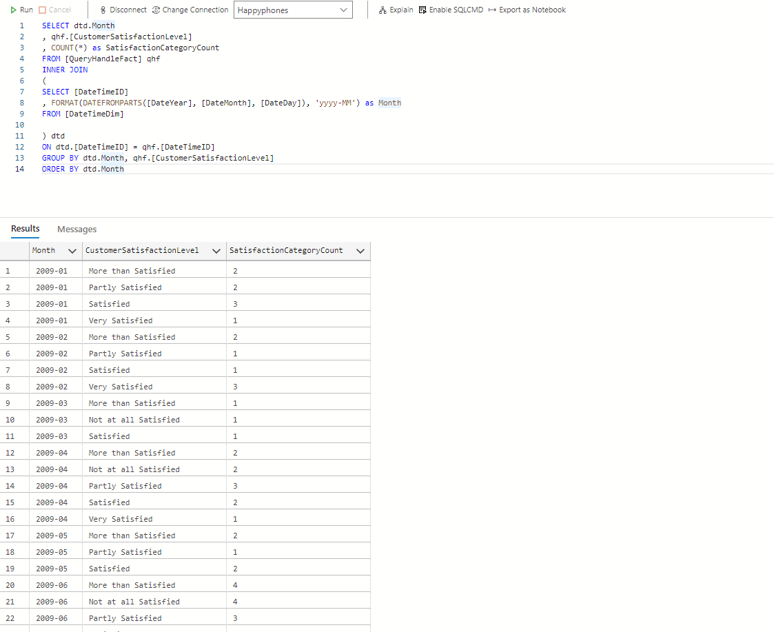
Queries for question 1
Question 2: Which staff and department were the most adept at handling customer complaints and what was the general feeling of customers after the complaints had been handled?
I was very eager to see what the answer to this question would be. In the SQL query in the image below, the “DepartmentName” column showed the department each staff belonged to, the “CustomerSatisfactionLevel” column explained the satisfaction level of the customers that were attended to, while the “SatisfactionCategoryCount” column showed the number of customers belonging to each satisfaction level. I took records from both the “QueryHandleFact” table and the “RepresentativeDim” table (hence the use of inner join).
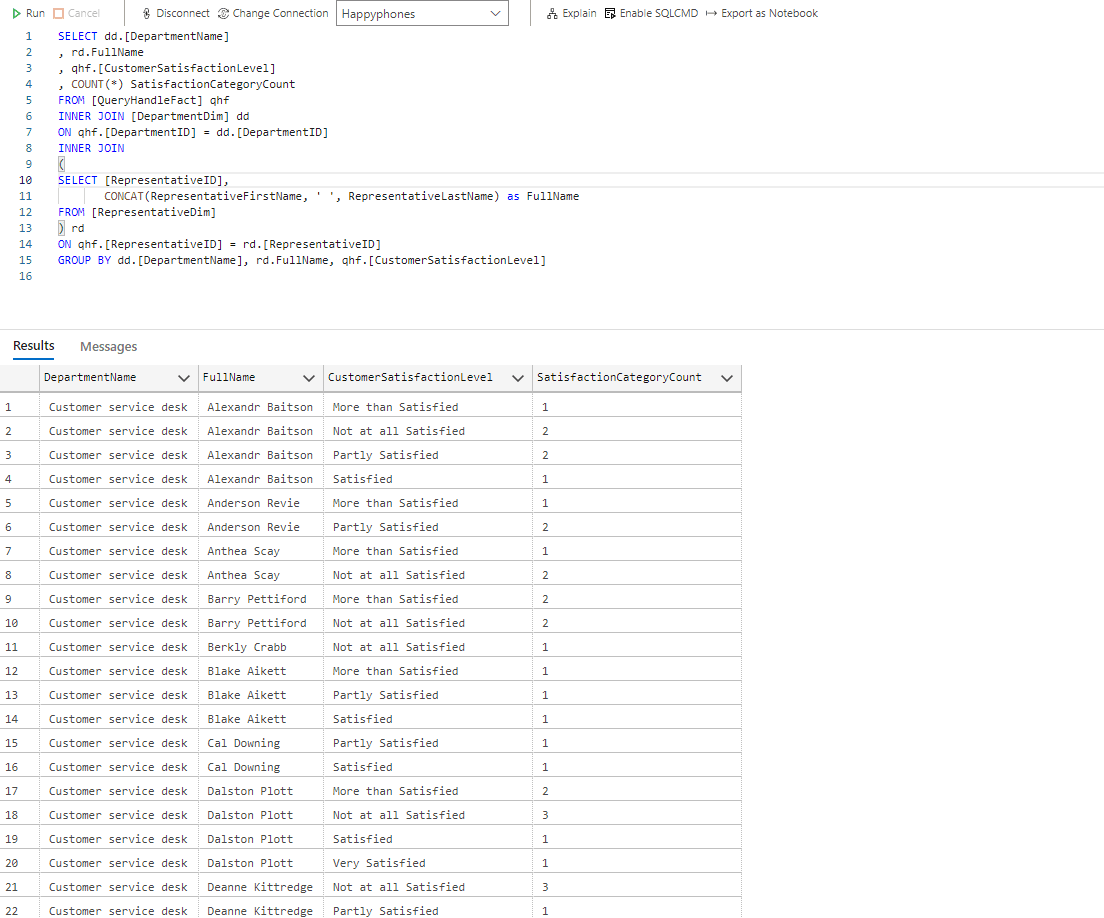
Queries for question 2
Question 3: Which question topics were the most asked by customers and how severe were these topics?
This question aims to help the stakeholders manage resource allocation when trying to find solutions to customer complaints. Question topics that had the highest count and severity are expected to take center stage and be tackled first.
A quick look at the query shows that records were accessed from both the “QueryHandleFact” and the “QuestionDim” tables present in the database schema. The result was grouped by the severity of the question and then the question topics.
Press enter or click to view image in full size
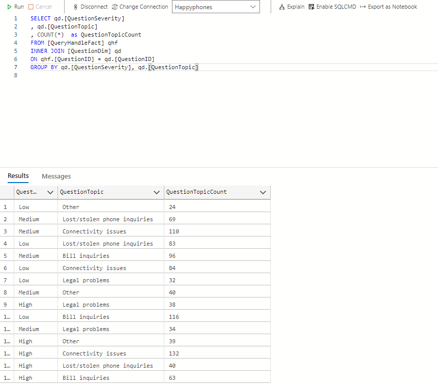
Queries for question 3
The results gotten from all the written SQL queries above were able to show important information about the data and even suggest recommendations to the stakeholders on what is best for the company. I had a meeting with the client and shared the questions as well as the results of the queries I wrote to answer the questions. He was quite satisfied with the insights gotten from this process.
6.) Visualizing Insights
The SQL queries that were written had already done a great job of uncovering insights from the data. However, as a data analyst, that shouldn’t be the end of the analysis. You are usually expected to communicate the insights you have been able to derive visually to your audience (in this case, the stakeholders) so they can easily grasp the message you are passing and make important decisions.
You might wonder. Why is visualization so important? There are many reasons why visualization but I’ll discuss one briefly. A good illustration to explain this is describing a teacher who is trying to explain a mathematical concept to a class of kindergarten students. The teacher understands the mathematical concept but needs to get it across to the students who are learning about it for the first time. A very good way for the teacher to pass the message across is to draw shapes and figures that can easily represent values in this concept and use these figures and shapes to explain. Our brains as humans digest visual information very quickly and thus the concept is understood by the students in little to no time. This illustration perfectly explains why visualizing insights is very important as a data analyst looking to pass information to an audience who might be hearing about it for the first time.
So back to my project. To visualize the intended information to the stakeholders, I chose to create a dashboard with three charts (a line graph, a bar chart, and a table). The client also instructed me to sort the bar charts in a given manual order as opposed to the descending/ascending sorting order. The image below explains to you the entire thought process of why the dashboard design as well as the reasons for choosing these charts to visualize insights.
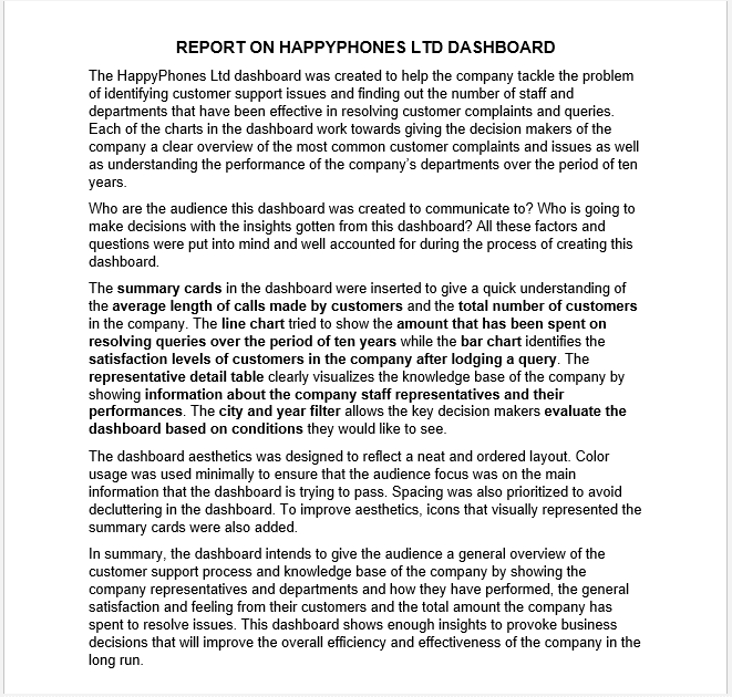
Dashboard report and explanation
7.) The Dashboard and Final Review
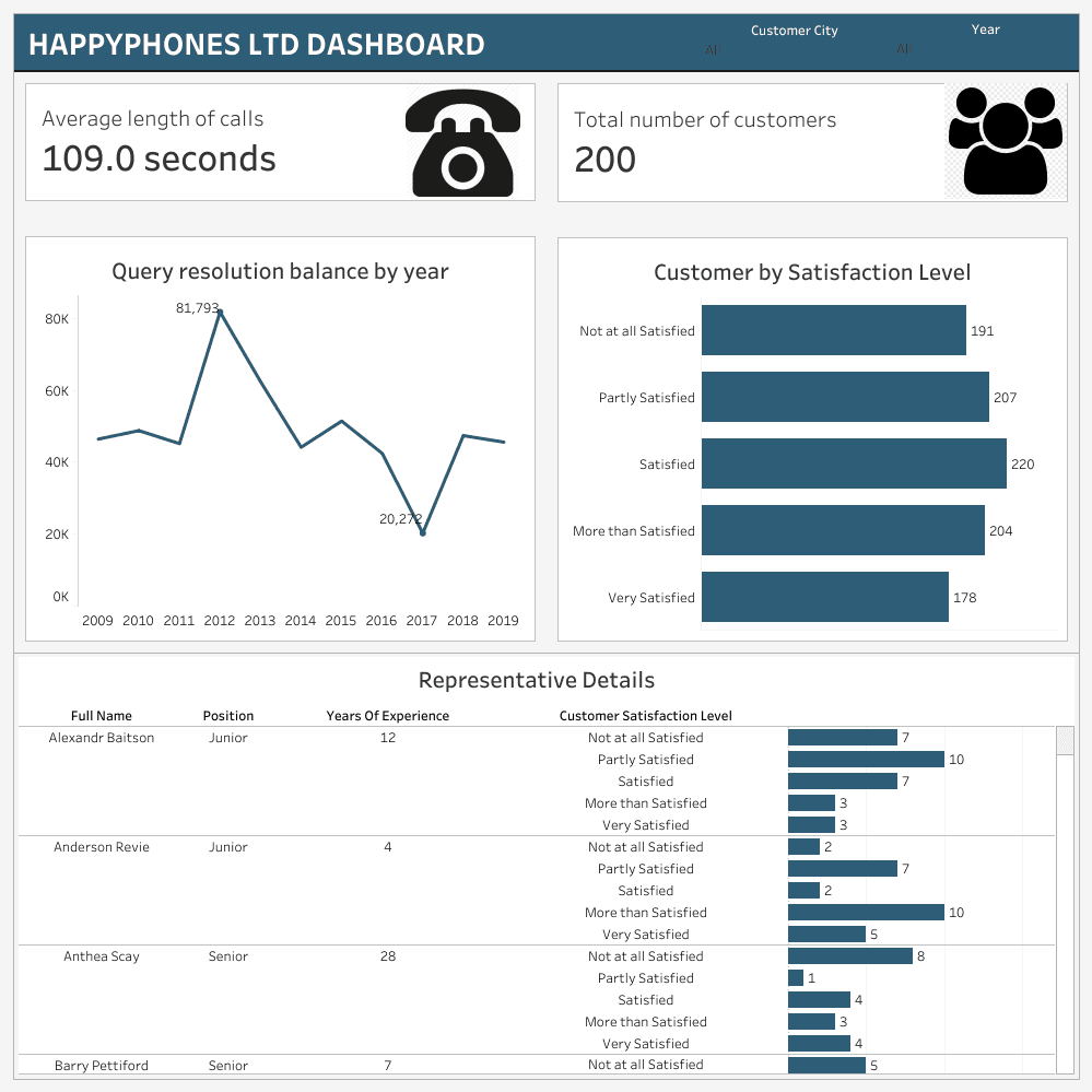
HappyPhones Dashboard
So far, I have been able to successfully explain the thought process behind the dashboard and I have also attached a picture format of the dashboard.
No dashboard is made to be perfect. I am sure that there will be corrections or criticisms in regards to the dashboard that I built. That’s perfectly fine. I am open to such corrections as this is still a learning process for me. However, what is most important is to visualize and communicate insights to your audience through your dashboard and once you can do that, then you have done your job as a data analyst.
I successfully submitted the project to the client before the deadline and got paid. He left a good review for me too.
In summary, it was nice to earn but most importantly, to learn.
Thank you for reading!
Gbolahan is a passionate, creative, and goal-oriented analyst. He is a strong advocate of using data to help derive insights and help clients and companies make better data-driven decisions.
Connect with me on Medium
Get monthly inspiration, blog updates, and creative process notes — handcrafted for fellow creators.
More to Discover

Analyzing and Visualizing Insights From A Freelance Project (Part 2)
Resources
Jul 22, 2022
This article is divided into two parts. The first part covers collation, cleaning, and modeling of the dataset with Microsoft Excel while the second part covers the querying of data with SQL and visualization of insights within a dashboard built using Tableau.
Here we are! I received positive responses from everyone who interacted with the first part of this article and I am glad I could share an experience that everyone could learn from. In the second part of this article, I will talk about querying the data with SQL, visualizing insights with charts and graphs, and then building a dashboard to show all the information visually at a glance.
So, let’s go!
5.) Uncovering data insights
After modeling the dataset and answering questions, the next task that I had to complete was to get insights from the dataset. Before I moved on to the next task, I decided to have a meeting with the client to show him the results of the modeled data and ask for his feedback and corrections. He appreciated the efforts I had made so far and loved the choice of suggested dimension tables. He commented that he felt they (the added tables) added some extra insights that were not present in the original database schema given in the dataset.
So it was time to uncover those hidden insights. Every data analyst has to be able to go through a given dataset, ask questions from the data, and find answers to these questions. This entire process is explained by the term “Exploratory data analysis”. Exploratory data analysis involves understanding the data in depth and learning its different characteristics. This will help to get a better feel of the data and find useful patterns in it. After analyzing the data critically myself, I had three questions that I wanted my SQL queries to answer.
Question 1: What was the monthly trend of complaints for all customer satisfaction levels in the company?
This question was intended to ensure that the stakeholders could monitor the growth rate of each satisfaction level of the customers so that faster actions can be taken when negative reviews are on the rise. In the image below, I showed the SQL queries that were written to find the answers to this question. The use of joins was very important in accessing records in both the “QueryHandleFact” and the “DateTimeDim” tables present in the database schema.
Queries for question 1
Question 2: Which staff and department were the most adept at handling customer complaints and what was the general feeling of customers after the complaints had been handled?
I was very eager to see what the answer to this question would be. In the SQL query in the image below, the “DepartmentName” column showed the department each staff belonged to, the “CustomerSatisfactionLevel” column explained the satisfaction level of the customers that were attended to, while the “SatisfactionCategoryCount” column showed the number of customers belonging to each satisfaction level. I took records from both the “QueryHandleFact” table and the “RepresentativeDim” table (hence the use of inner join).
Queries for question 2
Question 3: Which question topics were the most asked by customers and how severe were these topics?
This question aims to help the stakeholders manage resource allocation when trying to find solutions to customer complaints. Question topics that had the highest count and severity are expected to take center stage and be tackled first.
A quick look at the query shows that records were accessed from both the “QueryHandleFact” and the “QuestionDim” tables present in the database schema. The result was grouped by the severity of the question and then the question topics.
Press enter or click to view image in full size
Queries for question 3
The results gotten from all the written SQL queries above were able to show important information about the data and even suggest recommendations to the stakeholders on what is best for the company. I had a meeting with the client and shared the questions as well as the results of the queries I wrote to answer the questions. He was quite satisfied with the insights gotten from this process.
6.) Visualizing Insights
The SQL queries that were written had already done a great job of uncovering insights from the data. However, as a data analyst, that shouldn’t be the end of the analysis. You are usually expected to communicate the insights you have been able to derive visually to your audience (in this case, the stakeholders) so they can easily grasp the message you are passing and make important decisions.
You might wonder. Why is visualization so important? There are many reasons why visualization but I’ll discuss one briefly. A good illustration to explain this is describing a teacher who is trying to explain a mathematical concept to a class of kindergarten students. The teacher understands the mathematical concept but needs to get it across to the students who are learning about it for the first time. A very good way for the teacher to pass the message across is to draw shapes and figures that can easily represent values in this concept and use these figures and shapes to explain. Our brains as humans digest visual information very quickly and thus the concept is understood by the students in little to no time. This illustration perfectly explains why visualizing insights is very important as a data analyst looking to pass information to an audience who might be hearing about it for the first time.
So back to my project. To visualize the intended information to the stakeholders, I chose to create a dashboard with three charts (a line graph, a bar chart, and a table). The client also instructed me to sort the bar charts in a given manual order as opposed to the descending/ascending sorting order. The image below explains to you the entire thought process of why the dashboard design as well as the reasons for choosing these charts to visualize insights.
Dashboard report and explanation
7.) The Dashboard and Final Review
HappyPhones Dashboard
So far, I have been able to successfully explain the thought process behind the dashboard and I have also attached a picture format of the dashboard.
No dashboard is made to be perfect. I am sure that there will be corrections or criticisms in regards to the dashboard that I built. That’s perfectly fine. I am open to such corrections as this is still a learning process for me. However, what is most important is to visualize and communicate insights to your audience through your dashboard and once you can do that, then you have done your job as a data analyst.
I successfully submitted the project to the client before the deadline and got paid. He left a good review for me too.
In summary, it was nice to earn but most importantly, to learn.
Thank you for reading!
Gbolahan is a passionate, creative, and goal-oriented analyst. He is a strong advocate of using data to help derive insights and help clients and companies make better data-driven decisions.
Connect with me on Medium
Get monthly inspiration, blog updates, and creative process notes — handcrafted for fellow creators.
More to Discover
Analyzing and Visualizing Insights From A Freelance Project (Part 2)
Resources
Jul 22, 2022
This article is divided into two parts. The first part covers collation, cleaning, and modeling of the dataset with Microsoft Excel while the second part covers the querying of data with SQL and visualization of insights within a dashboard built using Tableau.
Here we are! I received positive responses from everyone who interacted with the first part of this article and I am glad I could share an experience that everyone could learn from. In the second part of this article, I will talk about querying the data with SQL, visualizing insights with charts and graphs, and then building a dashboard to show all the information visually at a glance.
So, let’s go!
5.) Uncovering data insights
After modeling the dataset and answering questions, the next task that I had to complete was to get insights from the dataset. Before I moved on to the next task, I decided to have a meeting with the client to show him the results of the modeled data and ask for his feedback and corrections. He appreciated the efforts I had made so far and loved the choice of suggested dimension tables. He commented that he felt they (the added tables) added some extra insights that were not present in the original database schema given in the dataset.
So it was time to uncover those hidden insights. Every data analyst has to be able to go through a given dataset, ask questions from the data, and find answers to these questions. This entire process is explained by the term “Exploratory data analysis”. Exploratory data analysis involves understanding the data in depth and learning its different characteristics. This will help to get a better feel of the data and find useful patterns in it. After analyzing the data critically myself, I had three questions that I wanted my SQL queries to answer.
Question 1: What was the monthly trend of complaints for all customer satisfaction levels in the company?
This question was intended to ensure that the stakeholders could monitor the growth rate of each satisfaction level of the customers so that faster actions can be taken when negative reviews are on the rise. In the image below, I showed the SQL queries that were written to find the answers to this question. The use of joins was very important in accessing records in both the “QueryHandleFact” and the “DateTimeDim” tables present in the database schema.
Queries for question 1
Question 2: Which staff and department were the most adept at handling customer complaints and what was the general feeling of customers after the complaints had been handled?
I was very eager to see what the answer to this question would be. In the SQL query in the image below, the “DepartmentName” column showed the department each staff belonged to, the “CustomerSatisfactionLevel” column explained the satisfaction level of the customers that were attended to, while the “SatisfactionCategoryCount” column showed the number of customers belonging to each satisfaction level. I took records from both the “QueryHandleFact” table and the “RepresentativeDim” table (hence the use of inner join).
Queries for question 2
Question 3: Which question topics were the most asked by customers and how severe were these topics?
This question aims to help the stakeholders manage resource allocation when trying to find solutions to customer complaints. Question topics that had the highest count and severity are expected to take center stage and be tackled first.
A quick look at the query shows that records were accessed from both the “QueryHandleFact” and the “QuestionDim” tables present in the database schema. The result was grouped by the severity of the question and then the question topics.
Press enter or click to view image in full size
Queries for question 3
The results gotten from all the written SQL queries above were able to show important information about the data and even suggest recommendations to the stakeholders on what is best for the company. I had a meeting with the client and shared the questions as well as the results of the queries I wrote to answer the questions. He was quite satisfied with the insights gotten from this process.
6.) Visualizing Insights
The SQL queries that were written had already done a great job of uncovering insights from the data. However, as a data analyst, that shouldn’t be the end of the analysis. You are usually expected to communicate the insights you have been able to derive visually to your audience (in this case, the stakeholders) so they can easily grasp the message you are passing and make important decisions.
You might wonder. Why is visualization so important? There are many reasons why visualization but I’ll discuss one briefly. A good illustration to explain this is describing a teacher who is trying to explain a mathematical concept to a class of kindergarten students. The teacher understands the mathematical concept but needs to get it across to the students who are learning about it for the first time. A very good way for the teacher to pass the message across is to draw shapes and figures that can easily represent values in this concept and use these figures and shapes to explain. Our brains as humans digest visual information very quickly and thus the concept is understood by the students in little to no time. This illustration perfectly explains why visualizing insights is very important as a data analyst looking to pass information to an audience who might be hearing about it for the first time.
So back to my project. To visualize the intended information to the stakeholders, I chose to create a dashboard with three charts (a line graph, a bar chart, and a table). The client also instructed me to sort the bar charts in a given manual order as opposed to the descending/ascending sorting order. The image below explains to you the entire thought process of why the dashboard design as well as the reasons for choosing these charts to visualize insights.
Dashboard report and explanation
7.) The Dashboard and Final Review
HappyPhones Dashboard
So far, I have been able to successfully explain the thought process behind the dashboard and I have also attached a picture format of the dashboard.
No dashboard is made to be perfect. I am sure that there will be corrections or criticisms in regards to the dashboard that I built. That’s perfectly fine. I am open to such corrections as this is still a learning process for me. However, what is most important is to visualize and communicate insights to your audience through your dashboard and once you can do that, then you have done your job as a data analyst.
I successfully submitted the project to the client before the deadline and got paid. He left a good review for me too.
In summary, it was nice to earn but most importantly, to learn.
Thank you for reading!
Gbolahan is a passionate, creative, and goal-oriented analyst. He is a strong advocate of using data to help derive insights and help clients and companies make better data-driven decisions.
Connect with me on Medium
Get monthly inspiration, blog updates, and creative process notes — handcrafted for fellow creators.